 "GreenN_Gold" (GreenN_Gold)
06/25/2015 at 15:53 • Filed to: None
 3
3
 16
16
 "GreenN_Gold" (GreenN_Gold)
06/25/2015 at 15:53 • Filed to: None |  3 3
|  16 16 |
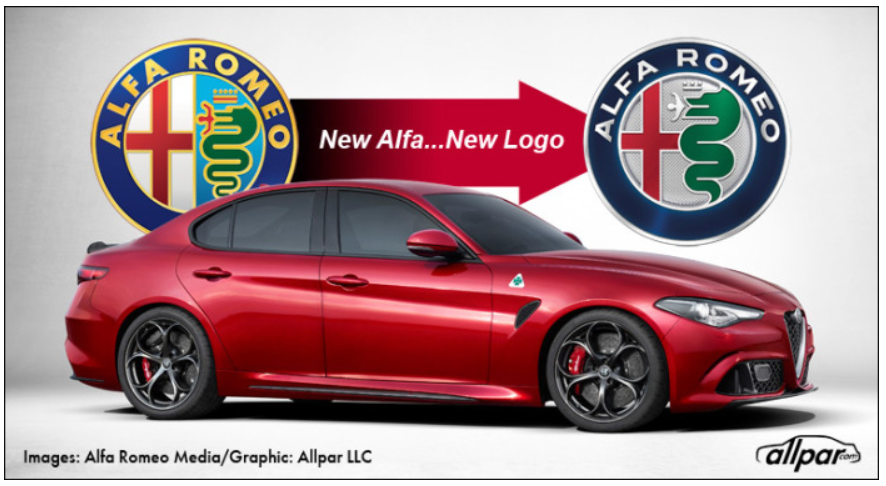
Not sure how many people care, but there was once an entire post on Jalopnik about the Alfa Romeo badge, and the dude in the mouth, and all that. From Allpar:

 ly2v8-Brian
> GreenN_Gold
06/25/2015 at 15:59 |
|
at least it still has color.
 $kaycog
> GreenN_Gold
06/25/2015 at 16:01 |
|
Oooh! I like it!
 lone_liberal
> ly2v8-Brian
06/25/2015 at 16:02 |
|
Some. They got rid of a lot in favor of that silver/gray background and drained the letters of their color.
 ly2v8-Brian
> lone_liberal
06/25/2015 at 16:04 |
|
I know, I’m trying to stay positive. At least they didn’t go full monochrome.
 Rico
> GreenN_Gold
06/25/2015 at 16:18 |
|
Looks good, the old one still looks good. I’m glad they left some color in it but a little more wouldn’t hurt. It looks very clean and modern though.
 dogisbadob
> GreenN_Gold
06/25/2015 at 16:22 |
|

looks like a black-and-white photoshop with the plus and snake colorized
 Bob Loblaw Made Me Make a Phoney Phone Call to Edward Rooney
> GreenN_Gold
06/25/2015 at 16:39 |
|
I have a leftover rear badge from my Milano that I’ll superglue over the top of mine when I buy it.
 Mr. Ontop, No Strokes, No Smokes...Goes Fast.
> GreenN_Gold
06/25/2015 at 16:50 |
|
Stupid question here, but I hear that car is going to have a 500hp engine. is it the same one that powers the hell cat, because FCA?
 TheJWT
> GreenN_Gold
06/25/2015 at 17:13 |
|
That font is godawful
 GreenN_Gold
> Mr. Ontop, No Strokes, No Smokes...Goes Fast.
06/25/2015 at 17:23 |
|
No it’s not, it’s a twin turbo V6, and the development of it has been credited to Ferrari and Maserati. There were some rumors that it might share some stuff with the Pentastar V6, but FCA would never go on record with that. The truth may lie somewhere in the middle, I have no idea.
 GreenN_Gold
> TheJWT
06/25/2015 at 17:25 |
|
I had nothing to do with it, I swear.
The R is pretty weak.
 TheJWT
> GreenN_Gold
06/25/2015 at 17:32 |
|
Seriously... The old one is so clean and classic. the new one looks like a shitty non-licensed version of the logo
 Nauraushaun
> Bob Loblaw Made Me Make a Phoney Phone Call to Edward Rooney
06/26/2015 at 10:08 |
|
Good. They’ve been shit for too long. Any reform is a good thing. As long as there’s still a dude getting devoured
 m2m, apex detective
> GreenN_Gold
07/02/2015 at 17:26 |
|
The engine should be pretty close to what propels the Ghibli (S), I think.
When it comes to shared parts, most manufacturers could be shamed to bits these days. :?
 m2m, apex detective
> TheJWT
07/02/2015 at 17:35 |
|
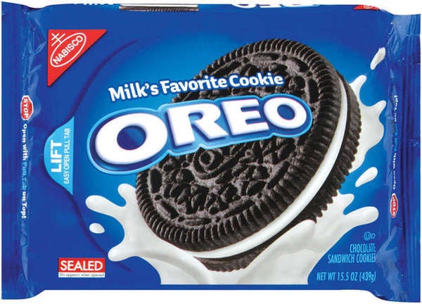
The shift in color for the outer ring just makes me think of these.

Alfa Oreos, so to speak.
 m2m, apex detective
> TheJWT
07/02/2015 at 17:36 |
|
“But this one is cheaper to print!”